Sunday 20 February 2011

Discovery: Kate Dawson's All In Onesies

The All In One Company was established by Kate Dawson in October '08. These gorgeous, comfortable and fun sleepsuits come in a huge variety of colours shapes and sizes for Men, Women & Children, with the option to create your own customized all-in-one with ears, feet, mittens, and even embroidered writing so you can get your childs name across the back! To top it all off, every creation is made by a team of experienced seamstresses in a lovely workshop in Northumberland, Great Britain, and any unused fabric/cut-offs are sent to local schools and charities for enterprize and fund-raising activities - nothing is sent to land-fill! What a bunch of stars!


The Return of Laura Ashley Girlswear

Laura Ashley Girlswear is back! The memories of my childhood interest in fashion all center around Laura Ashley Girlswear - the beautiful occasion dresses that made every little girl growing up in the 80s and 90s feel like a princess. I am so excited that they have returned! And they are back with a vengeance...


"Laura Ashley's Spring/Summer Girlswear collection is bright, bold, colourful, and fun! The aim was to create easy to wear, comfortable pieces that girls enjoy wearing. Everyday favourites that children remember for a lifetime. There are 2 themes for the season. Beach Hut is a nautical, sea-side story, with a classic red, white and blue colour palette, and pops of green grass and strawberry pink. Summer House is a pretty, feminine story based on garden picnics & tea parties. The colours are soft and girly taken from the English spring garden: Raspberry & Cupcake pink, with lime green, aqua and white".

Saturday 19 February 2011

Victorian Style

I have always been fascinated by the Victorian era in British history, in particular Victorian childhoods and the beautiful handcrafted toys and collectables. The Young Victoria (directed by Julian Fellowes) is one of my favourite British films - the costumes are stunning, as are the mannerisms, and though the film is romantic and 'grown-up' in theme, it is highly inspiring to me in the context of childrenswear. 


I am planning to conduct a victorian high society childrens photographic shoot in the grounds and interior of Osborne House (on the Isle of Wight), holiday home of Queen Victoria, Prince Albert and their nine children. This could almost play out as a follow-on to the young Victoria, photographing portraits of their children in their second home. The styling will be a mixture of traditional victorian childrens costume, as well as more contemporary pieces, with authentic hairstyles and accessories. It will however, be current, and more of a celebration of the era, rather than a replication of existing images. (I hope this makes sense!)


Wednesday 16 February 2011

Illustrator Profile: Rachel Elsome

I have recently discovered Rachel Elsome's work. It is very fresh and inspiring, and I am looking forward to meeting her this week to discuss the possibility of producing some work for the magazine. Her background is in fashion illustration as well as illustration for children's literature.


Illustrator Profile: Natasha Durley-Boot

I have worked with Natasha on previous projects, and have asked her to contribute an illustration sequence for the magazine. I really love her imaginative and dreamlike style, and she is coming up with some fantastic ideas for this latest brief. Some images of her work:


Friday 11 February 2011

A Midsummer Night's Dream

"Over hill, over dale,
Thorough bush, thorough briar,
Over park, over pale,
Thorough flood, thorough fire,
I do wander everywhere,
Swifter than the moon's sphere;
And I serve the fairy queen,
To dew her orbs upon the green.
The cowslips tall her pensioners be;
In their gold coats, spots you see;
Those be rubies, fairy favours,
In their freckles live our savours.
I must go seek some dew-drops here,
And hang a pearl in every cowslip's ear.
Farewell, thou lob of spirits, I'll be gone;
My queen and all her elves come here anon!"

   -Fairy, Scene i

(I have mentioned this quote as I think it would be an excellent idea for a photo shoot. It would be a really fantasy-oriented, updated version of this classic story, which a child Puck, and various Fairy kings/queens. Alternatively, this would be a fantastic concept for an Illustrative Spread. I absolutely love this quote from the book, and think it would make a great introduction to the spread).

Kareena Zerefos

Kareena Zerefos is an Australian artist, whom specialises in capturing young children in "moments of endearing expression". She uses a range of media including, pencil, gouache, tea and ink, and mixes tradition with technology.

Her work is wonderfully sweet, and I love the way she connects childhood with nature. The hand-drawn quality to the images is gorgeous, and reminds me of the hand-drawn illustrations that used to come hand-in-hand with children's storybooks, before the digital age hit us.

Her work has appeared in publications such as Papier Mache, Inside Out, Creative Review, Small and Frankie.


Sunday 6 February 2011

What to do...

I have been struggling a LOT lately, in particular with the name of the mag! I really like the idea and the image of fawn, but have been thinking (a dangerous pastime) and I think that the magazine needs a name which reflects the fact that it is "kidswear" to make it stand out on a magazine rack.

I am still undecided, but have been toying with some different names, in mocking up some front covers. The images are from previous photoshoots, and were taken by Nicola Rachel Smith.

I like the layout of this front cover, though I think that the typography needs to be a lot more exciting, and while it looks neat, it doesnt stand out enough. As for the name, Little Monsters is very sweet, but I think it is too immature for a magazine aimed at a fashion conscious market, and doesn't suit the adult tone of the imagery.

I really like this cover, it is very simple, neat and minimalist, with an eyegrabbing image in the centre. I really like the name 'Little Threads' and I like the mixture of typography. The name of the font used for "Little Threads" is Jane Austen, and I think it suits the ENGLISH design of the magazine.

I like the design of this one, and I think the name "Half Pint" is quite fun, as a name an adult would have for a child. I like the simplicity, and the minimal amount of writing.


This cover is in the style of Milk Magazine. It is eyecatching and the large font for the title works really effectively. It is "nice" and will draw in an audience, however, I dont think it reflects the design-led content of the magazine.

This is a tribute to German Luna Magazine's front cover. My mock up of this style was not hugely successful. I think it looks inexpensive and dull. My magazine needs something a little bit different, more design-led, to make in successful in the market in which i am placing it.


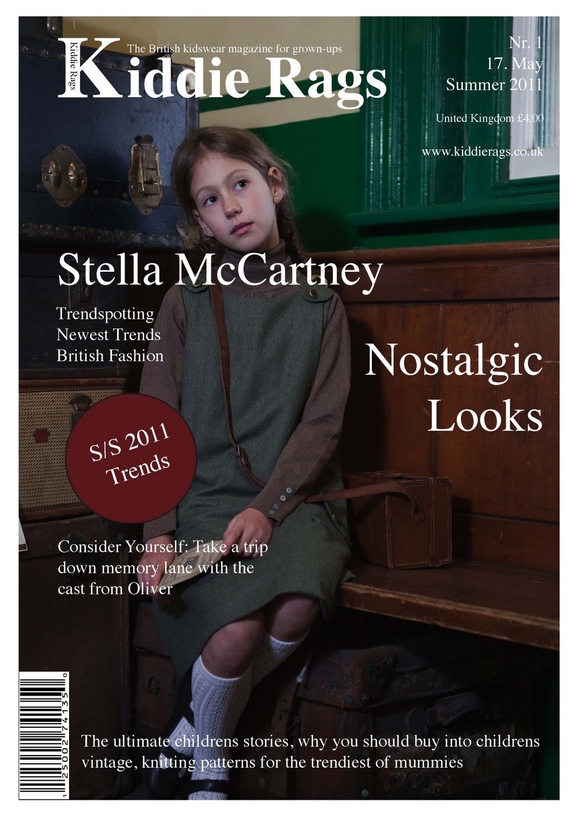
This is a hark to the style of Junior. I really like the bar across the bottom, to describe the contents. I really dislike the title, the colouring and the column of text down the side. Again, my mag requires something a little bit different and interesting.

Thursday 3 February 2011


This is my inspiration.
A beautiful young fawn in the forest. He resembles everything that the magazine stands for. Innocence, beauty, intrigue and a connection with nature.